
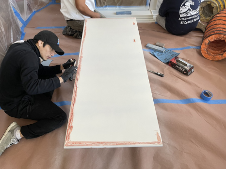
Fall is a natural time to make a kitchen feel warmer, richer, and more inviting. The best designer-approved kitchen paint colors work with the room’s fixed elements instead of competing with them.
If you are considering interior painting services in Manahawkin, NJ, start by reviewing your cabinets, counters, flooring, and light before choosing a wall color. Our interior painting services page shows the types of interior surfaces we work with.
Warm Neutrals Make a Kitchen Feel Cozy
Warm off-white, greige, beige, and taupe can soften a kitchen without making it look dull. The most successful neutrals usually echo an undertone already present in stone, tile, wood, or cabinetry. A creamier wall color can warm up cool counters, while a restrained taupe can give white cabinets more depth.
Earthy Greens Bring Natural Fall Color Indoors
Sage, olive, and moss-inspired greens can introduce seasonal color while still feeling grounded enough for year-round use. Sherwin-Williams describes warm green paint colors as colors with yellow or earthy influences that can add depth and warmth. In a kitchen, these shades often pair well with natural wood, white cabinetry, and aged brass or black hardware.
Richer Shades Can Add Seasonal Depth
Deeper clay, brown, muted burgundy, or charcoal can make a kitchen feel more dramatic, but they do not need to cover every wall. A richer shade may work better on an island wall, breakfast nook, pantry, or other defined area. The amount of daylight in the room should also influence how dark you go.
Coordinate Walls With Cabinets, Counters, and Finishes
Wall color should be chosen in context, especially when cabinets and counters are staying in place. Benjamin Moore’s kitchen cabinet color guidance offers examples of cabinet palettes that can help homeowners think about contrast and undertones. For a project that includes cabinet painting in Manahawkin, NJ, comparing wall and cabinet samples side by side can help prevent two nearly matching colors from clashing once the room is finished.
Test larger samples in morning, afternoon, and evening light before committing. Paint can look noticeably warmer or cooler as natural and artificial lighting change, so a color that looks right on a small chip may feel different across an entire wall. Viewing samples beside backsplash tile and countertops also makes undertone conflicts easier to spot.
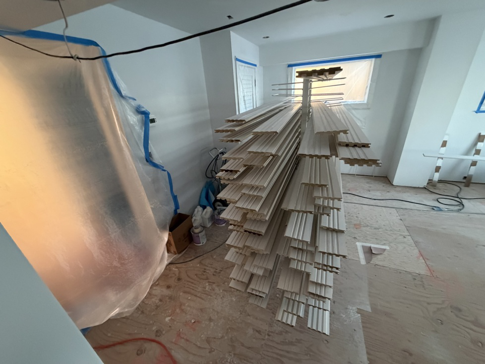
Bring Your Fall Kitchen Palette Together
A fall-inspired kitchen does not require an overtly seasonal palette. The strongest choices usually connect warm color, existing materials, and the amount of light in the room, creating a look that still feels appropriate after autumn ends. Homeowners comparing cabinet refinishing near me can also use paint planning as an opportunity to coordinate walls and cabinetry rather than treating them as separate decisions.
At Jack Luther Custom Painting, Staining & Power Washing, we help homeowners plan interior color and finishing projects around the surfaces already in their homes. If you need a local painting company in Barnegat, NJ, you can review more about our interior painting work before deciding how extensive your update should be.
For help turning a fall color idea into a coordinated kitchen plan, contact our team for a quote.